
Essay · Philosophy & Design
What if Plato’s Theory of Forms is the true foundation of successful brands, signs and industrial design?
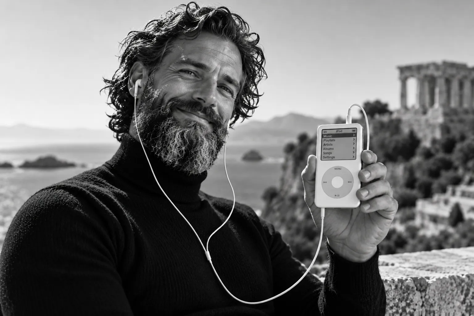
The Mercedes star, the bitten apple, Dieter Rams’s tuning dial, the green SPAR tree: billions of people have understood them without anyone ever having to explain them. What if they were not invented but remembered — reminders of archetypes that have accompanied humanity for thousands of years?
The thesis in two sentences. According to Plato, we recognise a tree because our soul has already encountered the Idea of the tree; all knowing is remembering. Designed things, brands and signs are most powerful when they claim nothing new but awaken such an archetype: star, sun, tree, fruit, circle and cross.
AnamnesisWhat if we don’t learn great brands, but recognise them?
Plato’s answer to the question of how knowledge is possible is: we do not learn, we remember. This doctrine of anamnesis is the key to everything that follows in this essay.
A thought experimentThe child and the tree
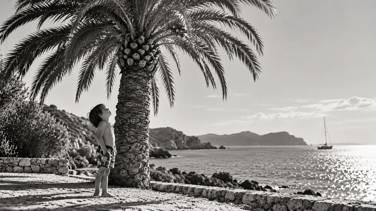
A child who has grown up in Central Europe sees a palm tree for the first time on a beach in Crete. It has no crown of leaves, no branches, no bark like the oak in the city park. And yet the child says without hesitation: “Tree.”
How does it know? No tree it has ever seen looked like this palm. So it must know something that all trees have in common and that is fully present in no single tree.
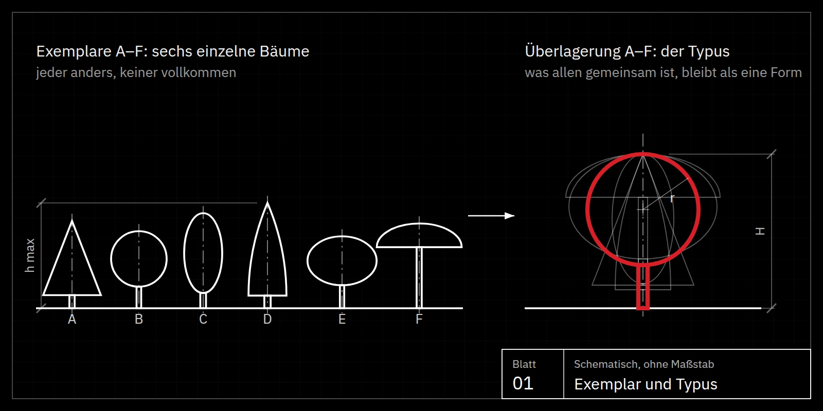
Knowing is remembering
Plato poses exactly this riddle in the dialogue Phaedo (73c–77a). Socrates asks: we see two pieces of wood and call them “equal”, although two pieces of wood are never perfectly equal. How, then, do we know Equality itself if we have never seen it?
His answer: we must have encountered it before we could perceive with our senses. The individual thing is merely the prompt that awakens a memory. Plato calls this remembering anamnesis.
In the dialogue Meno (81a–86b), Socrates demonstrates the proof. Through skilful questioning, an uneducated slave discovers a geometrical truth nobody has taught him: the square on the diagonal has twice the area. The knowledge was already there; it only had to be awakened.
PhaedrusThe soul has already beheld the Ideas
Where does this prior knowledge come from? In the Phaedrus (246a–249d), Plato paints a grand picture: before birth, the soul travels across the heavens like a charioteer and beholds the Ideas themselves — the Just, the Beautiful, the Good, the pure archetypes of all things.
At birth it forgets what it has seen. Yet every thing in the world carries a trace of its archetype. When we encounter it, the memory stirs, and we recognise.
The Idea (Greek idea or eidos, “form”, “appearance”) is, for Plato, the unchanging, perfect archetype of a thing. The things of the world are its imperfect copies. The tree outside the window grows and dies; the Idea of the tree remains.
The world of IdeasHow many Ideas are there?
Plato names no fixed number of Ideas. According to his theory, every group of things that share a name and form a kind has exactly one eternal and perfect Idea; every concept therefore corresponds to an archetype. The number of Ideas is thus unlimited and matches the variety of general concepts.
In the dialogues, Plato names Ideas of very different kinds: mathematical forms such as the circle, natural things such as tree, horse or human being, qualities such as warmth, size and colour, values such as justice and courage. Particularly remarkable for designers: everyday objects have their Idea too — bed and table in the Republic, the weaver’s shuttle in the Cratylus. Only for purely negative collective terms such as “non-Greek” did he reject a separate Idea, because their members have nothing in common.
Plato never wrote a self-contained account of his Theory of Forms. The overall picture is pieced together from many scattered passages in his dialogues, and scholars still debate the details today.
HierarchyThe order of the world of Ideas
The Ideas do not form an unordered set but a hierarchy. The more general an Idea, the higher it stands, for it encompasses the more specific ones; the lower Ideas participate in the higher.
At the top stands a single supreme Idea, the Idea of the Good. It gives all other Ideas their being and their knowability, just as the sun illuminates the world and makes it grow.
Below it, in his late work Sophist (254b–255e), Plato names the five “greatest kinds” (mégista génē). As fundamental categories they govern the structure of all being and of the world of Ideas itself: Being (ón), everything that is at all; Motion (kínēsis), the principle of change and becoming; Rest (stásis), the principle of permanence; the Same (tautón), the principle of identity; and the Different (tháteron), the principle of difference.
With these five kinds, Plato solves an ancient riddle: how can one say something false if non-being does not exist? Motion and Rest exclude each other, yet both participate in Being; each kind is the same as itself and different from the others. Non-being is therefore not absolute nothingness but the Different: whoever says “the table is not green” is only saying that its colour differs from green.
For designers, this holds a surprisingly practical idea. Every successful sign unites the Same with the Different: it is instantly recognised as an archetype, yet unmistakably distinct from all other signs. And it unites Rest with Motion — a permanent image that nevertheless radiates life.
MimesisImitation and the best form
In his late dialogues, Plato describes the relationship between things and Ideas as imitation (mímēsis). The more faithfully a living being or a thing reproduces the archetype of its kind, the closer it comes to its best form and realises its aretḗ, its fitness and excellence. Here lies the Platonic root of the thought that everything strives towards the best form of its kind.
Applied to brands, this means: a sign that touches such an archetype does not have to be learned. It is recognised — in fractions of a second, across languages, cultures and generations.
Archetype · Copy · Truth
Are you already among the archetypes, or still living among the copies?
Plato’s most famous allegory asks a question every designer, every brand and every human being must face: do we take the shadows on the wall for reality? Archetype, copy and truth are, for Plato, three stations along a single path.
Republic 514a–517aThe Allegory of the Cave: shadows on the wall
In the seventh book of the Republic, Plato describes people chained in an underground cave since childhood, their gaze fixed on the wall. Behind them a fire burns, and between the fire and the prisoners objects are carried past. The prisoners see only their shadows and take them for the whole of reality.
If one of them is freed, the light of the fire hurts him at first. Led out into daylight, he is dazzled; only gradually does he recognise the things themselves and finally the sun that makes everything visible. When he returns and tells the others, they laugh at him and cling to their shadows.
Republic 509d–511eArchetype and copy: the levels of being
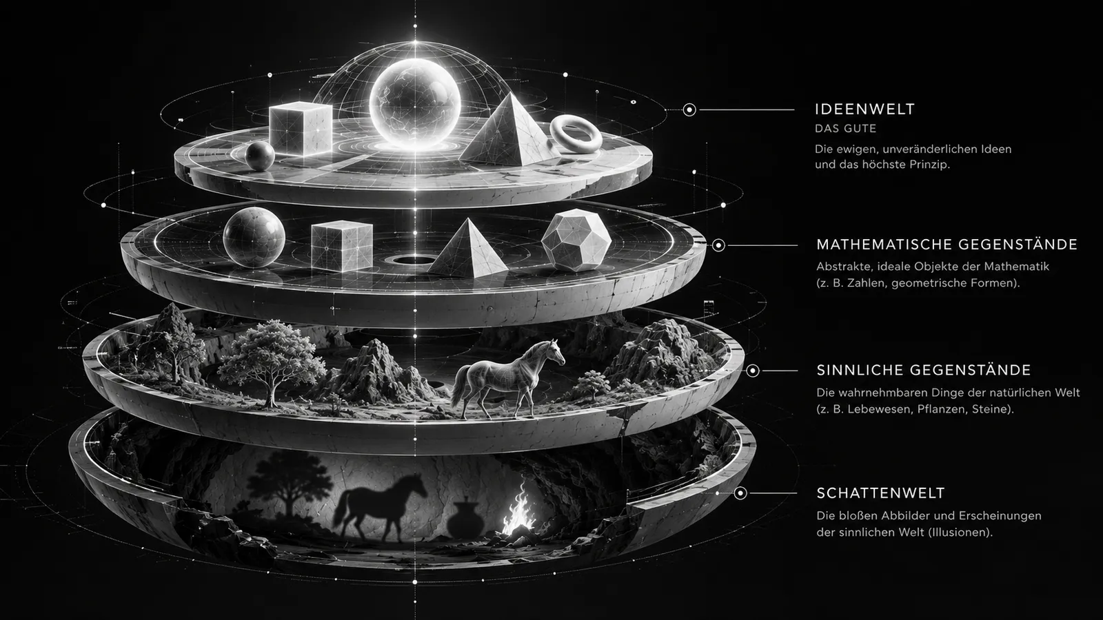
In the Allegory of the Divided Line, Plato arranges the world in four levels: at the bottom shadows and reflections, above them visible things, then mathematical objects, and at the top the Ideas. Each level is a copy of the one above. The tree in the garden is a copy of the Idea of the tree; its shadow on the lawn is a copy of a copy.
Each level corresponds to a mode of knowing: conjecture (eikasía) for shadows, belief (pístis) for things, discursive thought (diánoia) for mathematics and intellection (nóēsis) for the Ideas. Whoever knows only copies has opinions. Whoever beholds the archetypes has knowledge.
AlētheiaTruth: what is wrested from oblivion
For Plato, what is true is what truly is. The Ideas are what genuinely exists (óntōs ón), things merely participate in them, and their copies stand furthest from the truth. According to the tenth book of the Republic (597e), the painter who paints a bed is an imitator at the third remove from truth: he depicts not the Idea but only the carpenter’s bed, and even that only as it appears from one side.
The Greek word for truth, alḗtheia, can be read as unconcealment: that which has been wrested from oblivion (lḗthē). Martin Heidegger made this reading famous in the twentieth century. It closes the circle to anamnesis: truth is not something one invents, but something that emerges again from oblivion.
TodayThe cave of Instagram and Pinterest
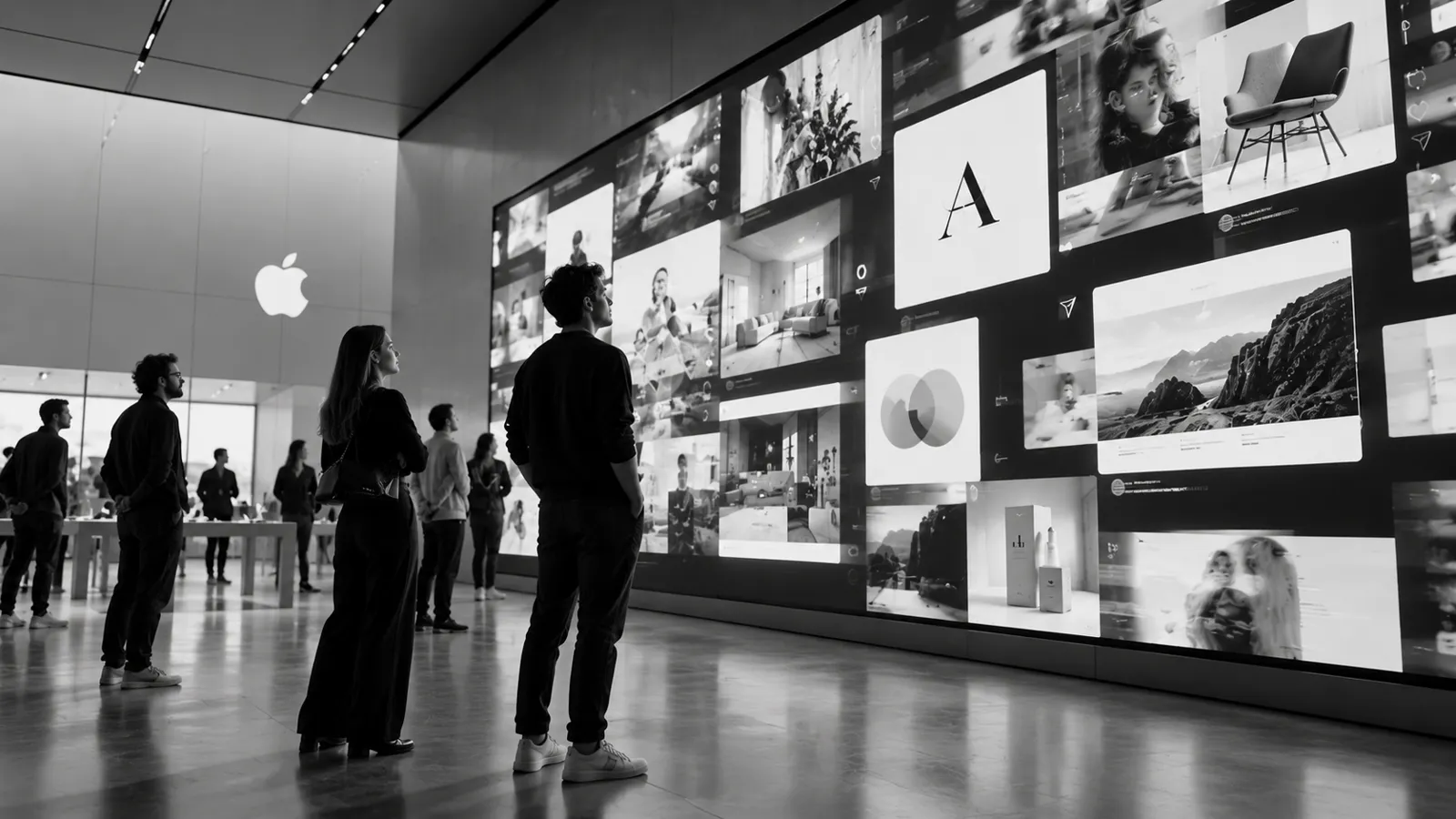
Plato’s cave now has a screen. On Instagram and Pinterest, seemingly brilliant design solutions scroll past every second: logos, websites, interiors and packaging, perfectly lit and shared thousands of times. Scroll long enough and you believe you have understood design — after all, all that is left to do is choose.
But what passes by are shadows on the wall. Every motif is the copy of a copy: a logo modelled on another logo, a moodboard made of moodboards, a website in the style of whichever website is currently being celebrated. The algorithm favours what has already been liked, and so the spiral tightens ever more around the same mediocrity.
Artificial intelligence accelerates this cycle. Have an AI confirm, combine or regenerate the images you have chosen, and you get back the average of all the shadows it has ever seen. The result is not an archetype but mush: smooth, pleasing and interchangeable.
In our agency we have long felt the countermovement. More and more clients open the first conversation with a sentence that would have been unthinkable only a few years ago: “I want a presence with an idea, a website with character — no AI sauce and no arbitrary mediocrity.” Without quoting Plato, they want out of the cave.
TasteslopTasteslop: when good taste turns into mush
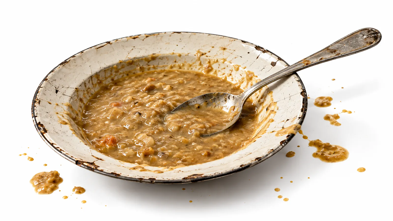
Since 2026 this phenomenon has had a name. The American trend forecaster and writer Emily Segal, co-founder of the collective K-HOLE, which once coined the term “normcore”, calls it tasteslop. It describes the inflation and homogenisation of good taste through algorithms, social media and artificial intelligence.
Segal’s examples are objects that once served as proof of style: Rimowa suitcases, Maison Margiela Tabi shoes, the Togo sofa, the gooseneck kettle. Each of them once said something about the person who chose it. Repeated thousands of times in the feed, they now say something only about the feed.
Taste, as Segal puts it in essence, is not a property of things themselves but a relationship between things, people, stories and the right moment. Where this relationship breaks down, only the symbols remain — imitated thoughtlessly, without style of one’s own and without personal meaning.
As an antidote, Segal names three abilities: discernment, the ability to justify why something is truly good; pattern recognition, a feel for art history and cultural references; and idiosyncrasy, a personal, grown signature that can hardly be copied.
Read through Plato, tasteslop describes exactly the lowest level of the Divided Line: copies of copies mistaken for the thing itself. And Segal’s three abilities are the way out: discerning instead of adopting, knowing where forms come from, and having the courage to ask about the essence of one’s own cause rather than about the next trend.
The way outTurning around: from the feed to the Idea
Read through Plato, the great designers in this essay turned around long before there were feeds. Rams did not ask what other radios looked like, but what a radio is. Loewy did not draw yet another shell but reduced it to its basic form. Stankowski did not depict bank buildings but order and growth. They took the path out of the cave towards the Idea, and that is why billions of people recognise their signs.
Which leaves the question from the heading, put to every designer, every brand and every reader: are you already among the archetypes, or still living among the copies? The test is simple. Don’t ask what the others are doing. Ask what the thing truly is.
The Good
What if good design invents nothing, but reminds us of something we have long known?
For Plato, the visible is the privileged place where human beings remember the Ideas. Design thus becomes more than giving form: it is the art of triggering a memory.
Phaedrus 250dBeauty, the only Idea we see with our eyes
The Phaedrus (250b–d) contains a sentence that is electrifying for every designer. Justice, temperance or wisdom, says Plato, have no lustre in their earthly copies. Beauty alone shines brightly through the sharpest of our senses, sight.
This means: the world of Ideas is closed to us, but at one point it has a window. Everyone who sees a perfectly designed thing and feels spontaneously “this is how it must be” is looking through that window.
This feeling of self-evidence is no accident. It is the moment of recognition. A sign does not feel “right” because it is new, but because it hits something we already know.
Republic 507b–509bThe Good as the sun
The highest of all Ideas, for Plato, is the Idea of the Good. In the Allegory of the Sun in the Republic, he compares it to the sun: just as the sun gives things light so that we can see them, and warmth so that they grow, the Good gives everything knowable its knowability and its being.
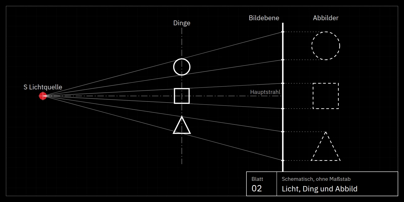
For Plato, then, the sun is not just one image among many. It is the image of the origin of all order. We will meet it again in this essay — in a radio’s tuning dial and in the wheel of a music player.
Timaeus and entelechyAll living things strive for their best form — design too
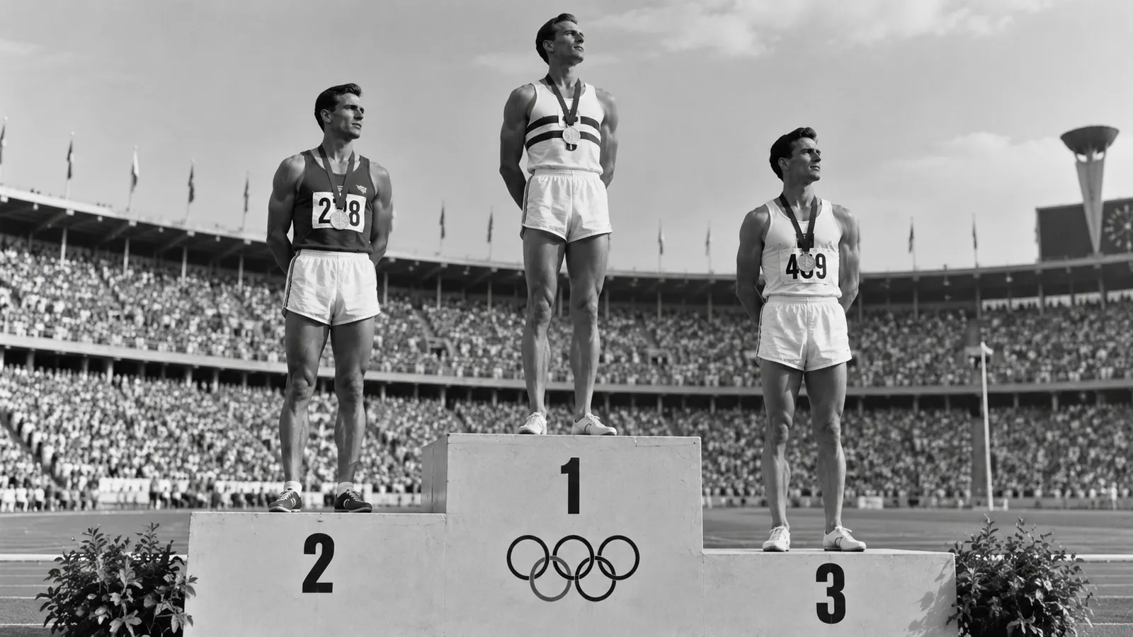
In the Timaeus (29e–30a), Plato tells how the world-builder, the Demiurge, created the cosmos. Because he himself was good, he wanted everything to become as good as possible; in doing so, he looked to the eternal archetype. The world is therefore ordered towards the Good.
From this follows the thought that carries this essay: every tree, every animal, every plant, the human being too, strives for the best form of its kind. Plato’s pupil Aristotle refined this thought and gave it a name: entelechy, the goal a thing carries within itself.
Good design shares this striving. It does not want to be original but good. And it reaches its goal where it comes so close to the archetype that people recognise the Idea in the designed thing.
Archetypes
What if behind every great sign there is an archetype older than any brand?
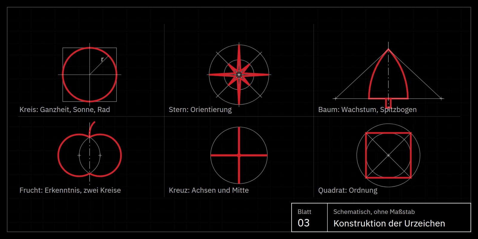
The most powerful signs of the present draw on a handful of archetypes that have accompanied humanity for millennia: sun and circle, star, tree, fruit, cross and square. Whoever uses them speaks a language every human being understands before they can read.
Sun, circle and wheel
The Nebra sky disc, around 3,600 years old by common dating, shows sun, moon and stars in gold on bronze. It is the oldest known concrete depiction of the sky in the world. Even here, the circle is the sign for the whole, for order and recurrence.
The sun disc becomes the wheel, the clock, the compass rose and the dial. They all share the same Idea: a centre from which all directions are equally reachable and from which one chooses.
Archetype IIThe star we navigate by
For millennia, the Pole Star showed seafarers the way. The Star of Bethlehem guided the Magi. The star is the archetype of orientation: something distant and unreachable that nevertheless points the way.
Whoever “follows their star” follows a calling. Hardly any archetype is so strongly linked with ambition, purpose and excellence.
Archetype IIIThe Tree of Life and the fruit of knowledge
In the Paradise of Genesis stand two trees, the Tree of Life and the Tree of Knowledge. In Norse mythology, the world ash Yggdrasil carries the cosmos. Trees of life appear from Mesopotamia to the woven carpets of Anatolia.
The tree stands for growth, nourishment, shelter and rootedness. Its fruit stands for knowledge and temptation at once. We will meet both again at SPAR and at Apple.
Archetype IVCross and square
The cross divides the world into four directions and marks a centre. The square stands for the built, the ordered, what human beings have secured. How powerful these two forms are is shown by the history of the city, to which the next section is devoted.
Depth psychologyJung’s archetypes as descendants of Plato’s Ideas
In the twentieth century, the Swiss psychiatrist Carl Gustav Jung described primordial images of the collective unconscious, which he called archetypes. He explicitly referred to Plato’s Ideas as their forerunners in intellectual history.
Whether one takes Plato’s journey of the soul literally or Jung’s unconscious: both describe the same observation. Certain images need no explanation because they are already within us.
The city
What if our cities are built on the same archetypes as our signs?
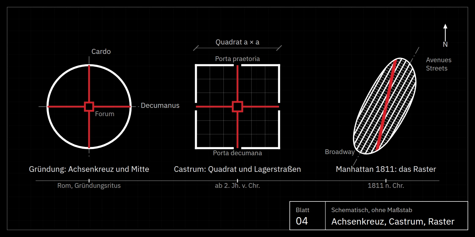
The two strongest primal signs of order, the circle with its crossed axes and the gridded square, have shaped not only logos but the ground plans of our cities. A line runs from the Roman city foundation through the military camp to the street grid of Manhattan.
Circle and cross: the oldest sign of the city
In Egyptian hieroglyphs, a circle divided by two crossing roads simply means “city”. The sign is more than 4,000 years old and already describes everything essential: a boundary separating inside from outside, and a centre where the roads meet.
Plato himself also thought of the city as round. In the Laws (745b–e), his late work on the best state, he places the city in the middle of the land, with the sanctuary at the centre and twelve parts radiating from it. The city is to be an image of the cosmic order.
Cardo and decumanusThe Roman city foundation: crossed axes and a sacred centre
The Romans adopted the founding of a city as a sacred act from the Etruscans. The founding myth tells that Romulus dug a pit at the centre, the mundus, and ploughed a furrow around the future city, the sulcus primigenius. This furrow marked the pomerium, the sacred boundary between city and land.
At the centre, the crossed axes were fixed with the groma, a cross of two right-angled sighting rods: the cardo maximus from north to south and the decumanus maximus from east to west. Archaeoastronomical studies show that the decumanus was often aligned with the sunrise on a particular feast day.
At the intersection of the two axes lay the forum, the religious and political heart of the city. The founding itself was performed by the augur, the bird-watcher who read the will of the gods; Romulus was considered king and augur in one person. Supreme oversight of the cult lay with the Pontifex Maximus, literally the “greatest bridge-builder” between gods and humans. From Augustus onwards, every Roman emperor bore this title: the ruler thus stood symbolically at the centre of the sacred order.
The circle with the cross is therefore no abstract pattern. It is the image of a world that has a centre, and of a person who bears responsibility at that centre.
CastrumThe Roman military camp: the square as order
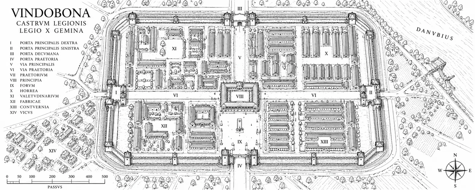
Where the city foundation was sacred, the military camp, the castrum, was practical. In the 2nd century BC, the Greek historian Polybius described the Roman camp as a square layout that every legion built to the same plan anywhere in the world. Every soldier knew where his tent stood — even at night, even in foreign lands.
The main streets had fixed names. The via principalis crossed the camp between the porta principalis dextra and sinistra. The via praetoria led from the main gate, the porta praetoria, to the centre; its continuation, the via decumana, ended at the porta decumana. Where the axes met stood the principia, the headquarters building, and the praetorium, the commander’s tent.
Many of these camps became cities. In Regensburg, the former legionary fortress Castra Regina, and in Turin, Roman Augusta Taurinorum, the grid can still be read in the city plan today. Aosta in northern Italy, founded in 25 BC, also retains its almost perfectly rectangular ring of walls.
CreteGortyn: Roman order on Crete
Gortyn lies in the Messara plain in the south of Crete. Already in Greek times it was one of the most powerful cities on the island, famous for its law code carved in stone. After the Roman conquest of Crete in 67 BC, Gortyn became, from 27 BC, the capital of the province of Creta et Cyrenaica, which comprised Crete and today’s eastern Libya.
Walking today among the olive trees through the ruins of the praetorium, odeon and nymphaeum, one sees how Rome carried its administrative order to the edge of the world. From here, law, taxes and roads were administered for a territory spanning two continents.
The gridFrom Rome to Manhattan: the grid as legacy
The Greeks knew the right-angled grid before Rome; Hippodamus of Miletus planned cities on a chessboard pattern in the 5th century BC. Rome, however, turned it into a system that could be repeated across an empire. This system lived on: in the Spanish colonial cities of the Americas, laid out from 1573 according to royal ordinances in a grid around a plaza, in Mannheim’s city of squares from 1606, and in Philadelphia, planned by William Penn in 1682.
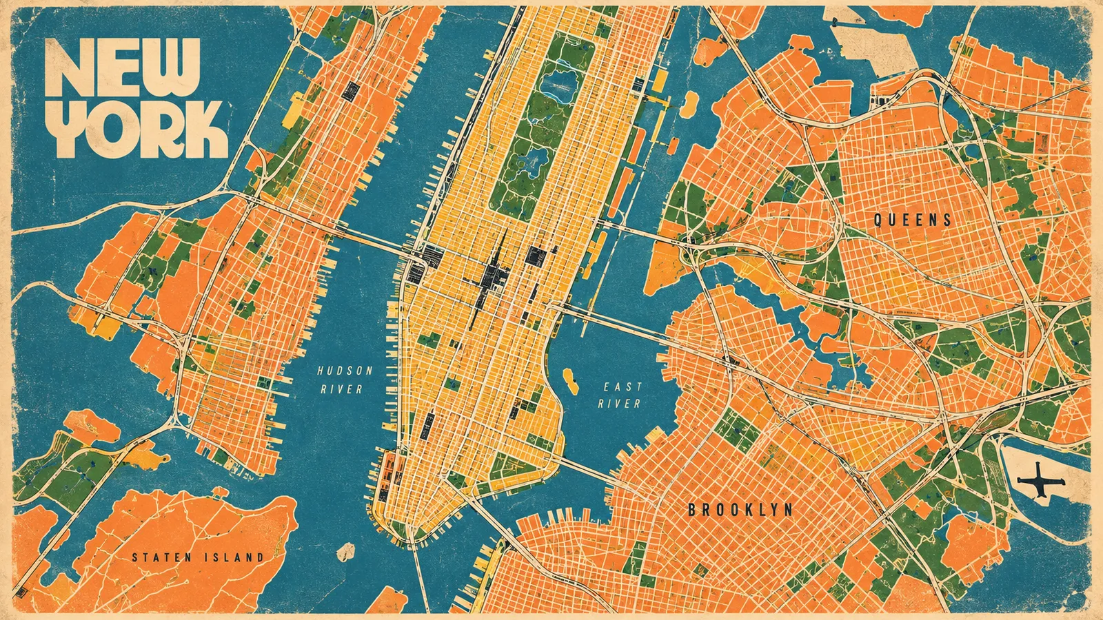
It found its greatest expression in 1811 in the Commissioners’ Plan for Manhattan. Twelve avenues run from south to north, hundreds of streets cross them from east to west: cardo and decumanus, repeated a thousand times. Only Broadway, an old trail, cuts diagonally across the grid and, where it meets the avenues, creates the city’s most famous squares, from Times Square to the Flatiron Building.
The square with the diagonal: we will meet this figure again shortly, in the logo of one of Europe’s largest banks.
Brands and designers
What if the iPod, the Mercedes star and the SPAR tree share the same secret?
The most successful signs and products of the 20th century have one thing in common: they do not invent a new visual language, they awaken an archetype. This is evident in the work of Raymond Loewy, Dieter Rams, Anton Stankowski and Jony Ive, as well as at Mercedes-Benz and Apple.
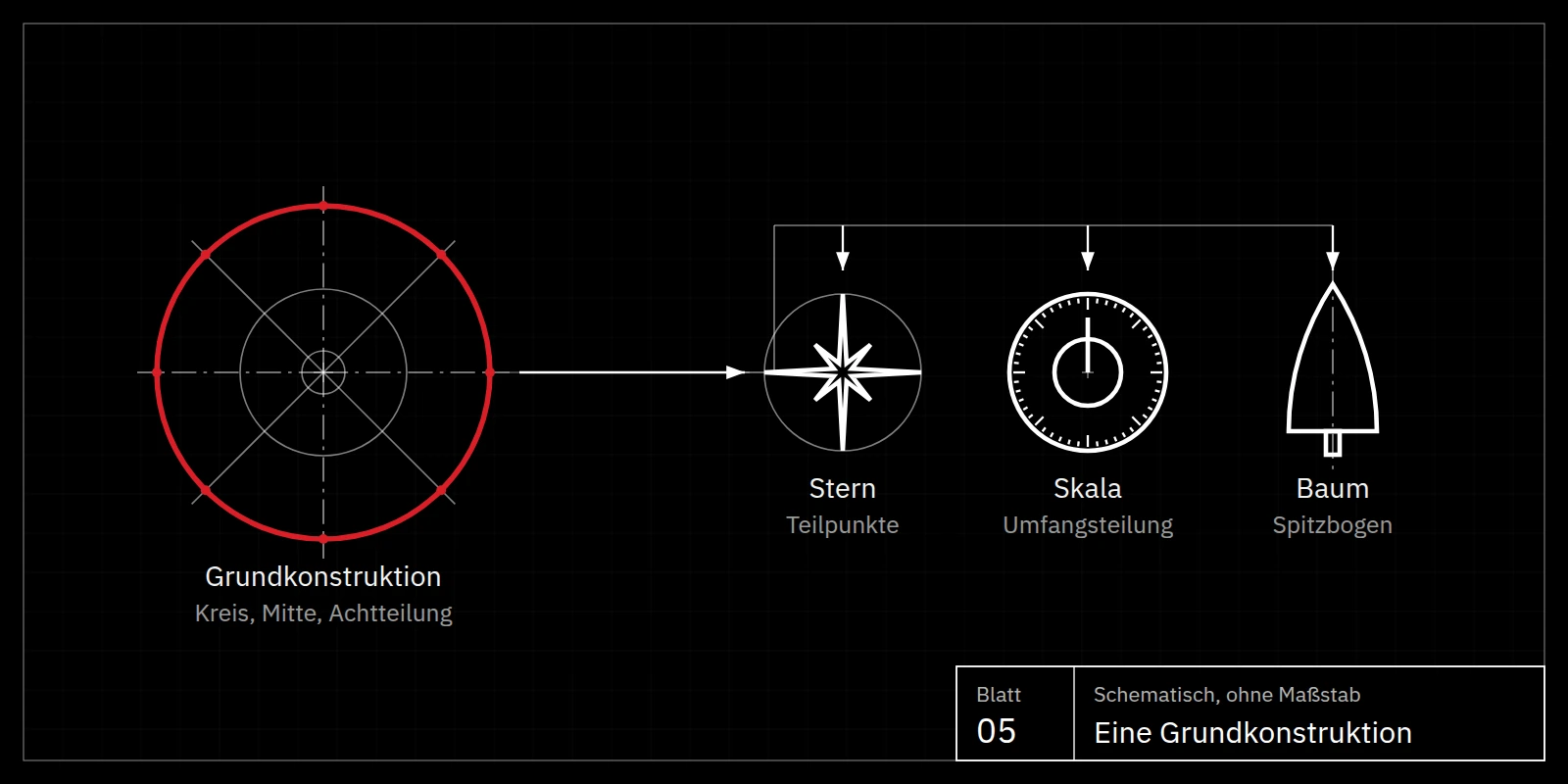
The Mercedes star: the archetype of the guiding star

As technical director of the Deutz gas engine factory, Gottlieb Daimler marked the family home with a star on a postcard showing a view of Deutz in 1872. Some thirty years later — Daimler had died in 1900 — Daimler-Motoren-Gesellschaft, at the suggestion of its chairman of the supervisory board, Alfred von Kaulla, was looking for a memorable sign for its Mercedes cars.
The idea came from his sons Paul and Adolf Daimler: they remembered their father’s postcard and suggested adopting this star as the company logo. On 24 June 1909, DMG registered the three-pointed star for protection; it stands for Daimler engines on land, on water and in the air. The ring was added in 1916, and the laurel wreath in 1926 after the merger with Benz & Cie.
The most famous emblem in automotive history was thus born, quite literally, of an act of remembrance. The star is the archetype of orientation and of striving for the highest. Whoever follows a star follows the best of its kind — and that is exactly the brand promise.
Apple · 1977Apple’s apple knows more than its designer
Apple’s first logo of 1976 showed Isaac Newton under an apple tree, an image of insight. In 1977 Rob Janoff designed the bitten apple, initially in rainbow colours. Janoff has always explained that the bite was there mainly so that, at small sizes, the apple would not be mistaken for a cherry.
The world nevertheless saw something else: the fruit from the Tree of Knowledge, Eve, the temptation of knowledge. Here anamnesis shows itself in its purest form. The Idea lies not in the logo but in the beholder; the sign merely awakens it. A designer can hit an archetype without intending to — and the archetype still works.
Braun · 1958Dieter Rams and the Braun T3: the sun disc for choosing

From 1955 to 1997, Dieter Rams shaped the design of Braun, influenced by the Bauhaus and the Ulm School of Design. In 1958 the T3 pocket radio appeared: a plain white rectangle, a perforated field for the loudspeaker and a round dial for tuning.
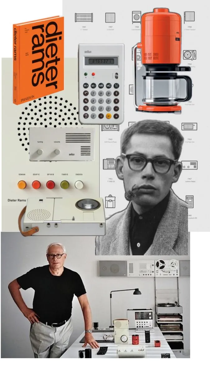
This dial is more than a control. It is the sun disc and the compass rose, the archetype of the circle from whose centre all directions are equally reachable and from which a person chooses their direction. Nobody had to learn how to operate it; one understood it before touching it.
Less, but better.
Dieter Rams
Read through Plato, Rams’s maxim means: leave out everything that does not belong to the Idea, until only the archetype is visible.
Apple · 2001Jony Ive and the iPod: the same ascent to the Idea, twice
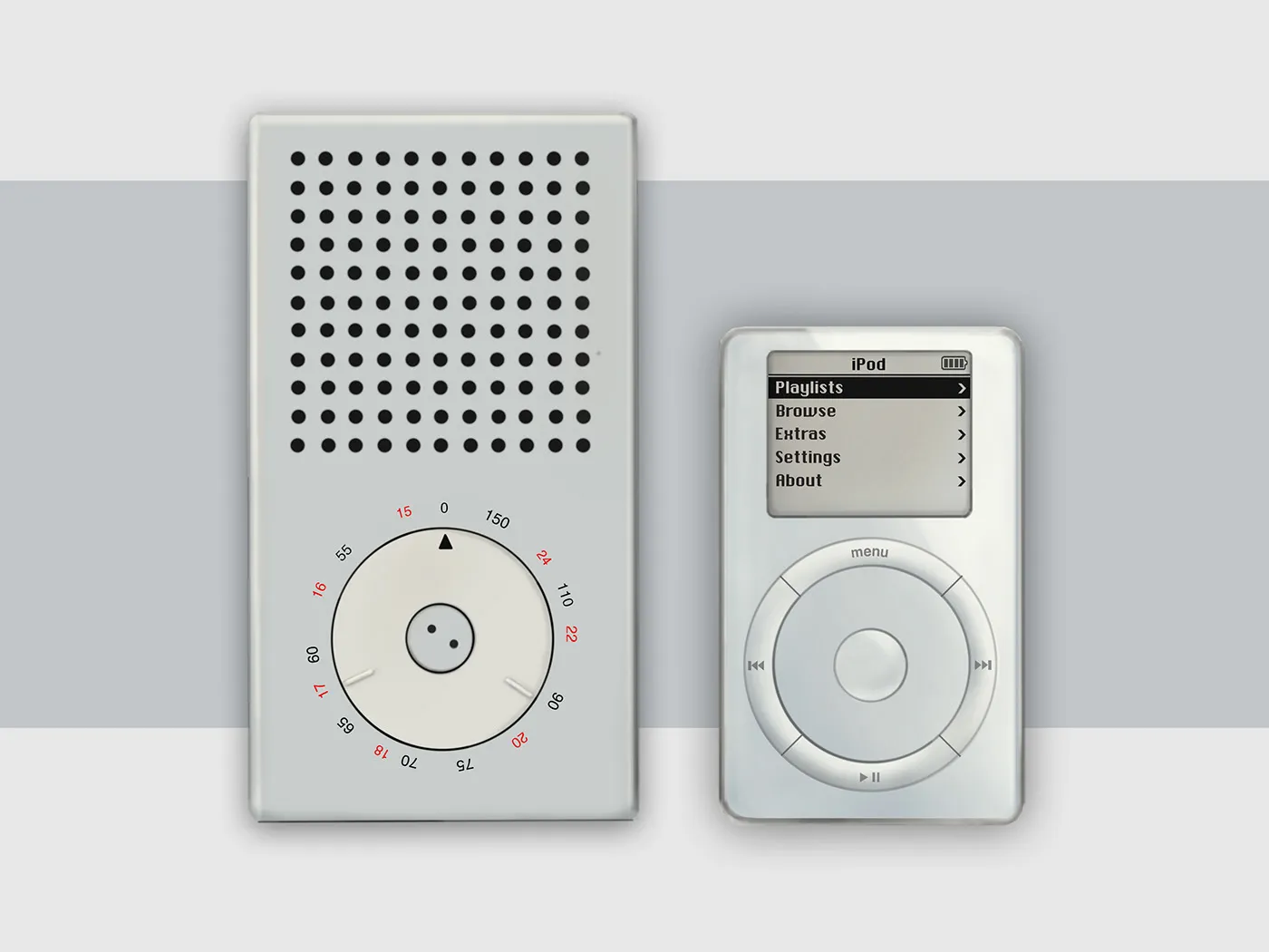
In 2001 Apple presented the iPod, designed by the team around Jonathan Ive. The resemblance to the Braun T3 is unmistakable, and Ive has never hidden his admiration for Rams; he even wrote the foreword to a book about him. Rams himself has repeatedly named Apple as one of the few companies designing according to his principles.
The iPod’s later click wheel made the sun disc the centre of a digital device. Hundreds of millions of people understood it immediately, across all languages, without instructions.
So is the iPod a copy? Read through Plato, no. A copy would, for Plato, be the copy of a copy, two steps removed from the truth (Republic 597e). Ive did not copy Rams; on a new technical foundation, he ascended a second time to the same Idea. That is why the wheel felt not like a quotation but like something self-evident.
SPAR · 1968Raymond Loewy and the SPAR tree: the power of the seemingly primitive
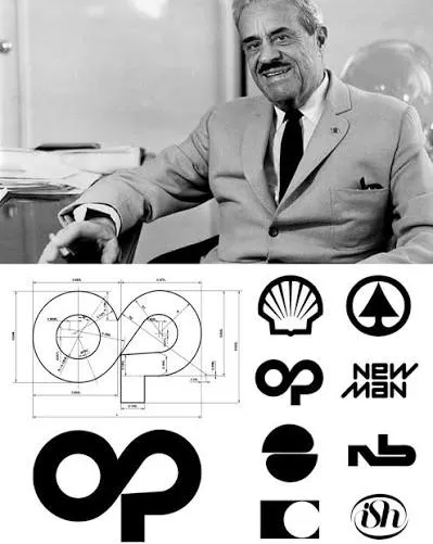
Raymond Loewy (1893–1986), the Paris-born pioneer of American industrial design, designed locomotives, the Greyhound bus, the Lucky Strike pack, the Shell and Exxon logos and the livery of Air Force One. In 1968 his Paris office, the Compagnie de l’Esthétique Industrielle, gave the SPAR logo the form it still has today.
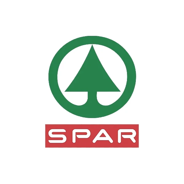
The sign seems almost primitive: a green fir tree, a wordmark. Yet the tree is built into the very name, for spar is the Dutch word for fir; originally, DESPAR stood for a motto about working together for everyone’s benefit. The tree that grows, shelters and nourishes everyone is the archetype of exactly this idea.
Loewy formulated the principle behind it himself: MAYA, “Most Advanced Yet Acceptable”. The new is only accepted if it connects to the familiar. In the language of an industrial designer, that is nothing other than Plato’s anamnesis.
Shell · 1971Raymond Loewy and the Shell scallop: the archetype in strict geometry
Three years after SPAR, in 1971, Loewy also gave the Shell emblem the form it still has today. The name goes back to Marcus Samuel senior, who imported seashells from the Far East to London in the late 19th century; his sons chose “Shell” as the name for the kerosene they shipped to Asia.

The first emblem of 1901 was a mussel shell; from 1904 it was followed by the scallop, Latin Pecten. Loewy did not reinvent this image. He placed the shell on a strict geometric construction and built it from a few warm, soft curves until only its essence remained.
The shell is one of the oldest archetypes of the sea, of origin and of protection; since the Middle Ages, the scallop has also been the sign of pilgrims to Santiago de Compostela. That Shell has been able to show its emblem mostly without a wordmark for over 50 years confirms this essay’s thesis: an archetype needs no label.
Deutsche Bank · 1974Anton Stankowski and Deutsche Bank: the square and the diagonal
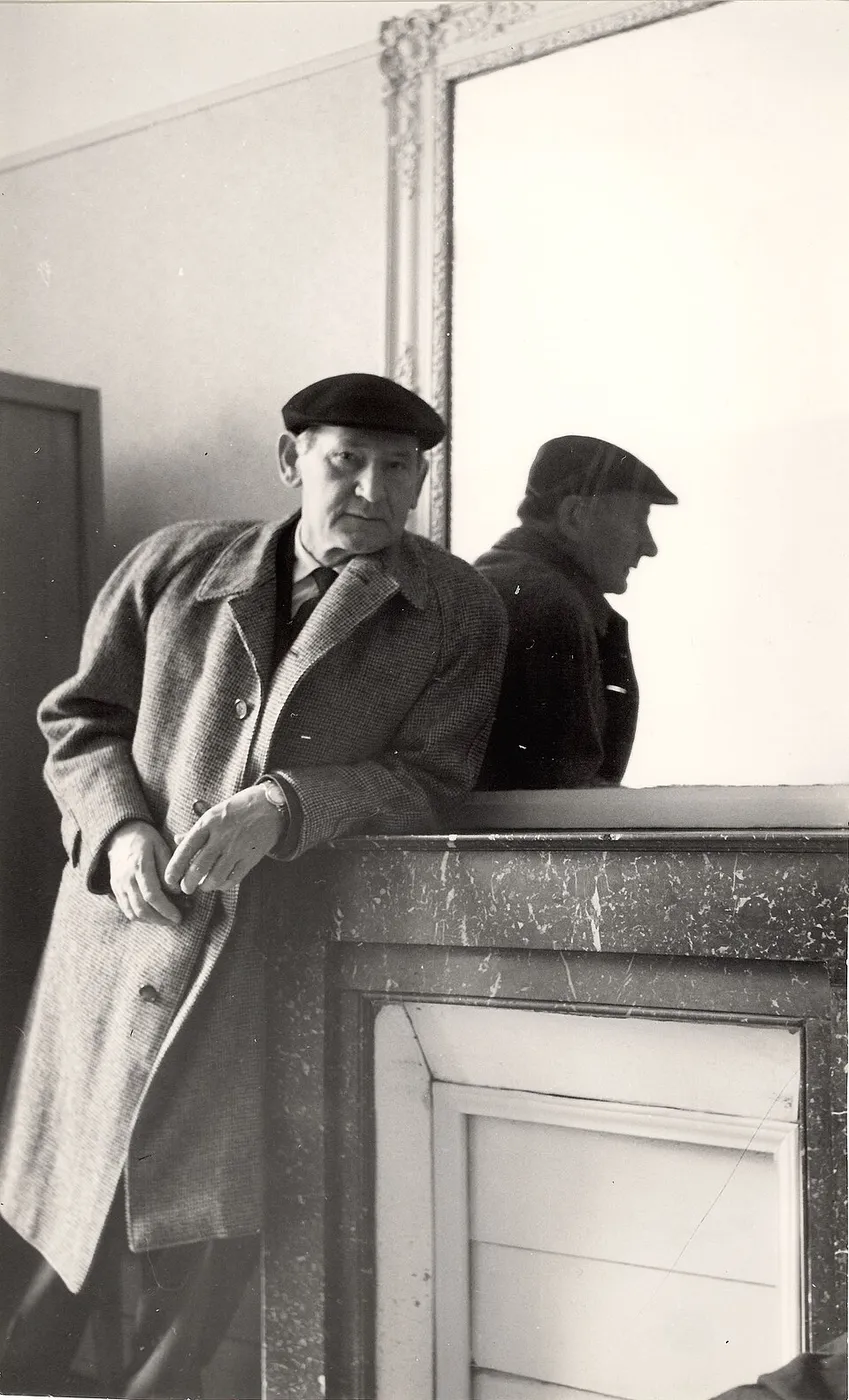
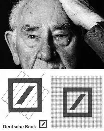
In April 1974, Deutsche Bank introduced its new logo, the “slash in the square”. In a competition with eight invited designers and around 140 entries, Anton Stankowski (1906–1998), the Stuttgart graphic designer and painter of concrete art, prevailed.
The sign consists of two primal forms. The square is the archetype of the built, the secured, of order — the same form as the Roman castrum. Within it, the diagonal rises from bottom left to top right: the archetype of growth. The bank still interprets it today as growth within a secure framework.
That the logo has existed for more than 50 years without the slightest revision and has effortlessly made the leap from letterhead to smartphone is the best proof: a sign that comes close to an Idea does not need to be modernised.
SynthesisThe shared secret
Star, apple, sun disc, tree, shell, square with diagonal: none of these signs is explained by a text. Each awakens an image that people have known for millennia. That is the shared secret of the most successful brands: they are not learned, they are recognised.
Conclusion
What does it remind us of? The most important question in design
The most important question for designers and brands is not “What is new?” but “What does it remind us of?”. Whoever takes it seriously looks not for the most original form, but for the form that comes closest to an archetype.
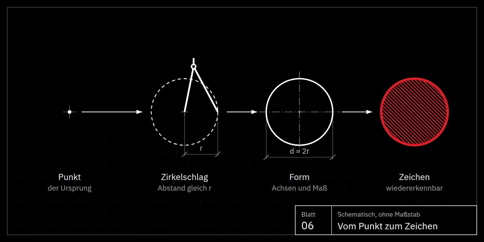
Three guiding questions follow for every brand, every sign and every product. First: which archetype does the thing carry within it? Star, sun, tree, fruit, circle, square or another image that people understand without explanation. Second: what can be left out until only the Idea is visible? Every superfluous detail conceals the archetype instead of showing it. Third: does the design strive for the Good? Not for the eye-catching, but for the best of its kind, just as Plato assumed for all living things.
2,400 years ago, Plato described what the most successful designers of the 20th century discovered in their practice. The Ideas have not disappeared; they wait within us to be recognised. Good design is the art of bringing about this moment of recognition.
Reference
Glossary
The thinkers, designers and terms used in this essay at a glance.
Philosophers & thinkers
- Plato
- Athenian philosopher (428/427–348/347 BC), pupil of Socrates and founder of the Theory of Forms. Key dialogues for this essay: Phaedo, Meno, Phaedrus, Republic, Timaeus, Sophist and Laws.
- Socrates
- Athenian philosopher and Plato’s teacher; leads the conversation in most of the dialogues.
- Aristotle
- Plato’s pupil, who criticised the Theory of Forms; coined the concept of entelechy, the inner goal of a thing.
- Carl Gustav Jung
- Swiss psychiatrist (1875–1961), founder of analytical psychology; described archetypes as primordial images of the collective unconscious.
- Polybius
- Greek historian (c. 200–120 BC); described the square Roman military camp.
- Hippodamus of Miletus
- Greek town planner of the 5th century BC; considered the father of the grid city.
Designers & brands
- Raymond Loewy
- French-American industrial designer (1893–1986); designed locomotives, the Lucky Strike pack, the Shell and Exxon logos and, in 1968, the current form of the SPAR logo, among others.
- Dieter Rams
- German industrial designer (*1932), at Braun from 1955 to 1997; designer of the T3 pocket radio (1958) and author of the maxim “Less, but better”.
- Jony Ive
- British designer (*1967), long-time head of design at Apple; his team designed the iPod in 2001.
- Anton Stankowski
- German graphic designer and painter of concrete art (1906–1998) with a studio in Stuttgart; created Deutsche Bank’s “slash in the square” in 1974.
- Rob Janoff
- American graphic designer; designed Apple’s bitten apple in 1977.
- Gottlieb Daimler
- German engineer (1834–1900); in 1872 marked his home in Deutz with a star on a postcard, the later model for the Mercedes star.
- Emily Segal
- American trend forecaster, artist and writer (*1988), co-founder of the trend collective K-HOLE; coined the term tasteslop in 2026.
- Max Bill
- Swiss architect, artist and designer (1908–1994), co-founder and first rector of the Ulm School of Design; coined the notion of “Good Form”.
- Otl Aicher
- German designer (1922–1991), co-founder of the Ulm School of Design; created, among other things, the corporate design of Lufthansa and the 1972 Munich Olympics.
- Hans Gugelot
- Designer and lecturer at the Ulm School of Design (1920–1965); designed the Braun SK 4 radio-phonograph together with Dieter Rams in 1956.
- Louis Sullivan
- American architect (1856–1924); the principle “form follows function” goes back to him.
- Marcus Samuel
- British entrepreneur (1853–1927), founder of the Shell Transport and Trading Company; the name Shell goes back to his father’s trade in seashells.
Terms & concepts
- Idea / Form (idea, eidos)
- For Plato, the eternal, unchanging and perfect archetype of a thing; visible things are its copies.
- Anamnesis
- Recollection: according to Plato, knowing is remembering the Ideas the soul beheld before birth.
- Idea of the Good
- The highest of all Ideas; it gives all others being and knowability. Plato compares it with the sun in the Allegory of the Sun.
- Allegory of the Cave
- Plato’s allegory from the Republic (514a–517a) of prisoners who take shadows for reality; an image of the path from copy to archetype.
- Divided Line
- Plato’s division of reality into four levels — shadows, visible things, mathematical objects and Ideas — with the modes of knowing eikasía, pístis, diánoia and nóēsis.
- Archetype and copy
- The archetype is the perfect Idea of a thing, the copy its imperfect reproduction; a copy of a copy stands even further from the truth.
- Alētheia
- Greek for truth; can be read as unconcealment, that which is wrested from oblivion (lḗthē).
- Mégista génē
- The five “greatest kinds” from Plato’s Sophist: Being, Motion, Rest, the Same and the Different.
- Mimesis
- Imitation; in Plato’s late work, the relationship of things to their archetypes.
- Aretē
- Fitness, excellence: the best form a thing reaches when it faithfully realises its archetype.
- Demiurge
- The world-builder in Plato’s Timaeus who shapes the cosmos as well as possible by looking to the eternal archetype.
- Entelechy
- Aristotelian term for the goal a thing carries within itself and towards which it grows.
- Archetype (Jung)
- For C. G. Jung, a primordial image of the collective unconscious that recurs in myths, symbols and dreams.
- MAYA principle
- Raymond Loewy’s formula “Most Advanced Yet Acceptable”: the new is accepted when it connects to the familiar.
Brand & design
- Brand emblem
- The graphic sign by which a brand is recognised; legally protected as a trademark, in everyday use mostly called a logo.
- Logo
- Short for logotype; today an umbrella term for a company’s pictorial mark, wordmark and combination mark.
- Pictorial mark
- A brand emblem without lettering, such as the Mercedes star, the Apple apple or the Shell scallop.
- Combination mark
- A combination of sign and wordmark, as with SPAR’s fir tree and name.
- Branding
- The process of giving a brand a recognisable identity, from name and emblem to language, product and behaviour.
- Corporate design
- The consistent visual identity of a company: emblem, colours, typefaces, grids and their application.
- Brand core
- The central idea a brand stands for and to which all signs and messages lead back.
- Recognition value
- A sign’s ability to be recognised quickly and reliably; according to this essay, the higher the closer it comes to an archetype.
- Functionalism
- A design attitude that derives form from the purpose and use of an object.
- Form follows function
- Guiding principle of modernism after Louis Sullivan (1896): the shape of a thing results from its task.
- Good Form
- Term coined by Max Bill for objective, long-lasting design committed to use; title of his 1949 exhibition.
- Ulm School of Design
- Hochschule für Gestaltung Ulm (1953–1968), the most influential design school of the post-war era; close collaboration with Braun.
- Concrete art
- An art movement working with purely geometric means without depicting anything; its representatives include Max Bill and Anton Stankowski.
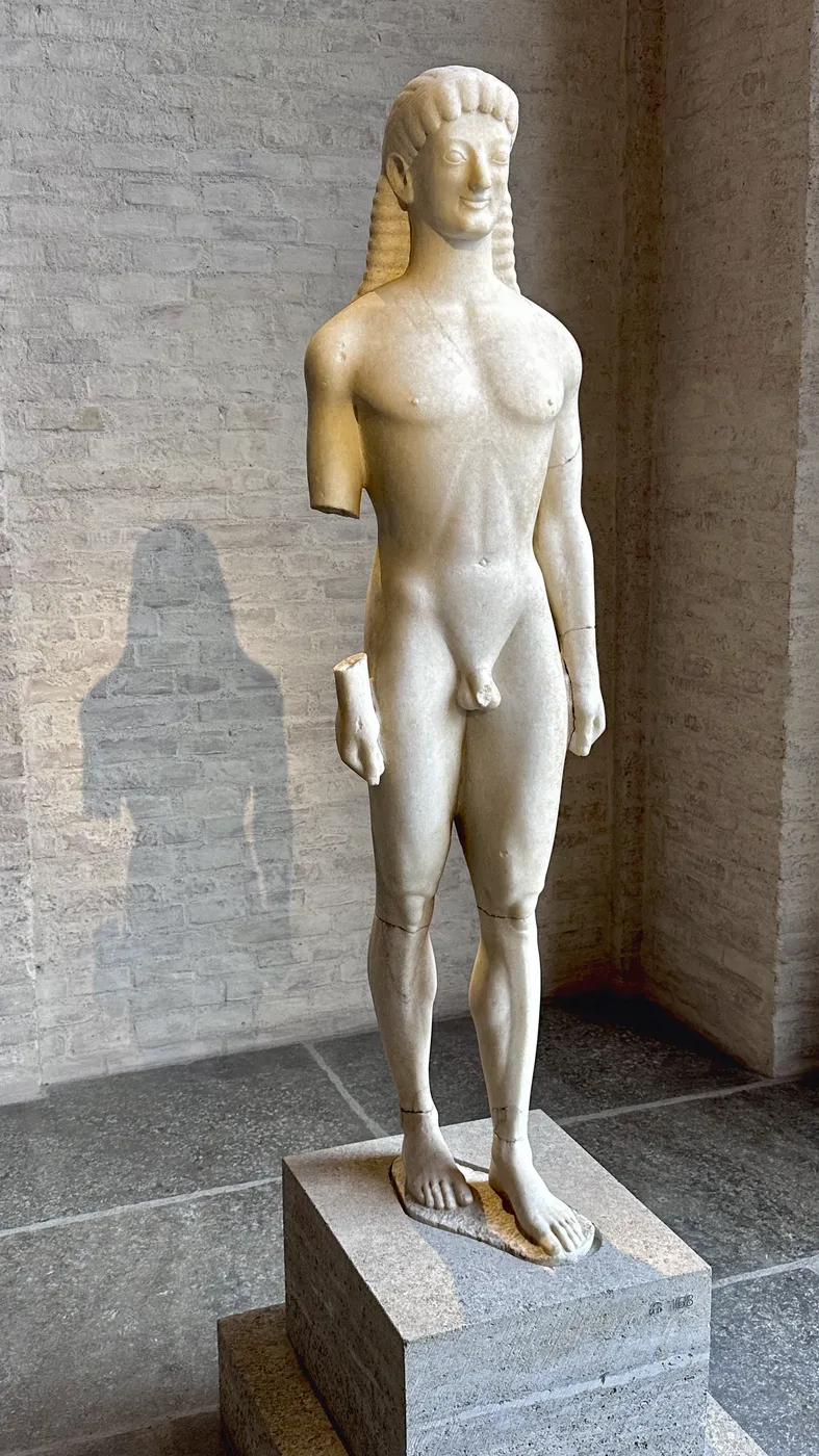
- Kouros
- Archaic Greek statue of a naked youth showing not an individual but a type, such as the Apollo of Tenea.
- Tasteslop
- Emily Segal’s term (2026) for the inflation and homogenisation of good taste through algorithms, social media and AI.
City & order
- Cardo maximus
- North–south main axis of a Roman city.
- Decumanus maximus
- East–west main axis of a Roman city; often aligned with the sunrise on a feast day.
- Groma
- Roman surveying instrument of two sighting rods crossed at right angles, used to fix the crossed axes.
- Pomerium
- The sacred boundary of a Roman city, drawn with the plough as the sulcus primigenius.
- Pontifex Maximus
- Rome’s supreme priest, literally the “greatest bridge-builder”; a title of the emperors from Augustus onwards.
- Castrum
- Roman military camp with a fixed square plan, camp streets and four gates; the nucleus of many cities.
- Commissioners’ Plan
- The 1811 plan that divided Manhattan into a right-angled grid of avenues and streets.
FAQ
Plato and the Theory of Forms
What is Plato’s Theory of Forms in simple terms?
According to Plato, every thing has an eternal, perfect archetype, the Idea or Form. The things we see are imperfect copies of it. We recognise a tree as a tree because we carry the Idea of the tree within us.
What is the difference between archetype and copy in Plato?
For Plato, the archetype is the eternal, perfect Idea of a thing; the copy is everything that reproduces this Idea only imperfectly. The visible tree is a copy of the Idea of the tree; its shadow or a painting of it is a copy of a copy and therefore even further removed from the truth.
What is the Allegory of the Cave?
The Allegory of the Cave from the seventh book of the Republic describes prisoners who see only shadows on a cave wall and take them for reality. Only those who free themselves recognise the things themselves and finally the sun, Plato’s image for the Idea of the Good. The allegory stands for the path from copy to archetype.
What does truth mean in Plato?
For Plato, what is true is what truly is: the unchanging Ideas. Sensible things only participate in truth; their copies stand furthest from it. The Greek word alḗtheia can be read as unconcealment — that which is wrested from oblivion.
How many Ideas are there according to Plato?
Plato names no fixed number. For every kind of things that share a name there is exactly one Idea; the number of Ideas therefore matches the variety of general concepts. At the top of the world of Ideas stands the Idea of the Good, below it the five “greatest kinds” from the Sophist: Being, Motion, Rest, the Same and the Different.
What does anamnesis mean in Plato?
Anamnesis means recollection. In the Phaedo and the Meno, Plato teaches that the soul beheld the Ideas before birth. Knowing is therefore remembering, triggered by perceiving a thing.
What does Plato’s Theory of Forms have to do with design and brands?
Signs and products are most powerful when they remind people of an archetype they already know, such as star, sun or tree. They then do not have to be learned but are recognised instantly.
Brand emblems and their designers
What does the Mercedes star mean?
In 1872 Gottlieb Daimler marked his family home in Deutz with a star on a postcard. His sons Paul and Adolf remembered it and proposed the star as a logo; in 1909 Daimler-Motoren-Gesellschaft registered it. The three points stand for motorisation on land, on water and in the air.
Why is the Apple apple bitten?
Designer Rob Janoff explained that the bite prevents the apple from being mistaken for a cherry. Many people nevertheless read it as the fruit from the Tree of Knowledge — an example of how an archetype can work even unintentionally.
Did the iPod copy Dieter Rams’s Braun T3?
The 2001 iPod clearly resembles the 1958 Braun T3, and Jony Ive has always acknowledged Rams as a role model. Read through Plato, both draw on the same archetype: the sun disc as the circle of choice.
Who designed the SPAR logo?
The current form of the SPAR logo with the green fir tree dates from 1968 and comes from Raymond Loewy’s Paris office. The word “spar” means fir in Dutch.
Who designed the Shell logo?
Raymond Loewy created today’s form of the Shell scallop, the “Pecten”, in 1971. The first Shell emblem of 1901 was a mussel shell, from 1904 a scallop; the name goes back to Marcus Samuel senior’s trade in seashells.
What is Raymond Loewy’s MAYA principle?
MAYA stands for “Most Advanced Yet Acceptable”: as progressive as possible, yet familiar enough to be accepted. The new succeeds when it connects to the familiar.
What does the Deutsche Bank logo mean?
Anton Stankowski’s “slash in the square” was introduced in 1974. It is interpreted as growth within a secure framework: the square stands for order and security, the rising diagonal for development.
Logo design, branding and brand communication
How do you develop a successful brand emblem?
A successful brand emblem does not begin with form but with the question of what the brand stands for at its core. From this an archetype is derived that people understand without explanation, such as star, tree, circle or square, and reduced until only the essential remains. Only then do colour, typography and applications follow.
What makes a good logo?
A good logo is simple, distinctive, legible at any size and long-lasting. Above all, it reminds people of something they already know and is therefore recognised in fractions of a second. The emblems of Mercedes-Benz, Apple, Shell and Deutsche Bank have met these criteria for decades.
Why are the most successful logos so simple?
The closer a sign is to an archetype, the fewer details it needs. Simple forms are recognised faster, remembered better and work from app icon to illuminated sign. Raymond Loewy and Anton Stankowski therefore reduced their signs to a few basic geometric forms.
Should a logo be modernised regularly?
A sign that comes close to an archetype hardly needs modernising: the Deutsche Bank logo has been unchanged since 1974, the Shell scallop almost unchanged since 1971. Careful technical adjustments, for instance for digital applications, make sense. Changing the basic image, however, destroys the recognition value built up over time.
What is branding?
Branding is the entire process of giving a brand a recognisable identity: name, emblem, colours, typography, language, products and behaviour. Branding succeeds when all these elements go back to a shared Idea that people recognise.
What are archetypes in branding?
Archetypes are primordial images understood across cultures, such as the hero, the sage, the star or the tree. The term goes back to C. G. Jung, who referred to Plato’s Ideas. Brands that credibly embody an archetype are understood faster and anchored more strongly emotionally.
What makes brand communication successful?
Successful brand communication is clear, repeatable and consistent across all channels. It does not explain what a brand wants to be, but shows an image people remember. The clearer this image, the less effort each individual message requires.
What is tasteslop?
Tasteslop, literally taste mush, is a term coined in 2026 by the American trend forecaster Emily Segal for the homogenisation of good taste through algorithms, social media and artificial intelligence. Former markers of style are copied so often that they no longer express anything personal. Read through Plato, they are copies of copies.
How do you avoid interchangeable design and AI mediocrity?
By starting not with other people’s images but with the essence of your own cause: what does the brand stand for, which archetype does it carry within it? Instagram, Pinterest and AI deliver averages of solutions already seen. An idea with character emerges only through discernment, knowledge of design history and the courage to take a stance of one’s own.
Why are symbols more powerful than words?
An image needs no shared language: a star or an apple is understood worldwide, a slogan only where its language is spoken. That is why the strongest brands carry their message in a sign that works even without a wordmark, like the Shell scallop.
What can industrial and B2B brands learn from Plato’s Theory of Forms?
Complex machines and services, too, are remembered through simple images. B2B brands win when they reduce the core of their offering to a clear archetype — such as precision, reliability or growth — and show this image consistently in emblem, product and communication. Deutsche Bank’s square with the diagonal is an example.
Functional design
What is functional design?
Functional design shapes a product from its use: form follows from the task, not from decoration. Good functional design is not sober but self-evident; one understands it before using it, like the tuning dial of the Braun T3.
What does “form follows function” mean?
The phrase goes back to the American architect Louis Sullivan, who wrote in 1896 that form ever follows function. It became the guiding principle of modernism, from the Bauhaus to the Ulm School of Design. Plato anticipated the idea: in the Republic he measures the beauty of an implement by its use.
What are Dieter Rams’s ten principles for good design?
According to Dieter Rams, good design is innovative, useful, aesthetic, understandable, unobtrusive, honest, long-lasting, thorough down to the last detail, environmentally friendly and as little design as possible. His short formula for it: “Less, but better.”
What does the Ulm School of Design have to do with good design?
The Ulm School of Design (HfG Ulm, 1953–1968) shaped post-war functional design with designers such as Max Bill, Otl Aicher and Hans Gugelot. Its collaboration with Braun produced a formal language that Dieter Rams developed further and that, via Jony Ive, reaches all the way to Apple.
Why is good design long-lasting?
Good design is oriented to the essence of a thing, not to fashions. What comes close to an archetype does not age, because it was never bound to its time. That is why the 1958 Braun T3 and many brand emblems of the 1970s still feel self-evident today.
City and order
What are cardo and decumanus?
Cardo and decumanus are the two main axes of a Roman city. The cardo runs from north to south, the decumanus from east to west; the forum usually lay at their intersection.
Does New York’s street grid come from the Romans?
Manhattan’s grid is based on the Commissioners’ Plan of 1811, with avenues running north–south and streets east–west. It stands in a long tradition reaching from Greek grid cities via the Roman castrum to the colonial cities of the modern era.
Sources
Plato passages according to Stephanus pagination: Phaedo 73c–77a · Meno 81a–86b · Phaedrus 246a–250d · Republic 509d–517a (Divided Line and Cave) · Sophist 254b–259b · Republic 507b–509b, 597e · Timaeus 29e–30a · Laws 745b–e.
Read onRelated articles
Michael Saupe — writes about marketing, art and the ideas behind them. More essays at michaelsaupe.com.